Design project for Mediright Corporate Healthcare.
After an array of works for the Wright Group, Outhouse Media was approached by Mediright Corporate Healthcare. Mediright falls under the umbrella of the Wright Group of companies. The original aim was to revamp their current website which had become outdated. The brief was to create a user friendly and engaging modern website presence to reflect where Mediright stood in the marketplace. It also needed relevant and informative content, updated by the client as and when needed.

Website design and development
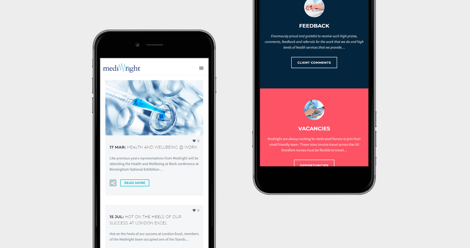
Capturing the essence of healthcare, with sophisticated pastel tones and informative, yet friendly language to engage. We discussed and agreed the best way forward was a clean and clinical approach to show content in an easy to use way. A site to reflect the brand new colour palette. The main health care services were formed into single pages under an overview linked system with concise content to inform the reader. Our introduction of a warming pink tone helps highlight links and draw attention to the eye.
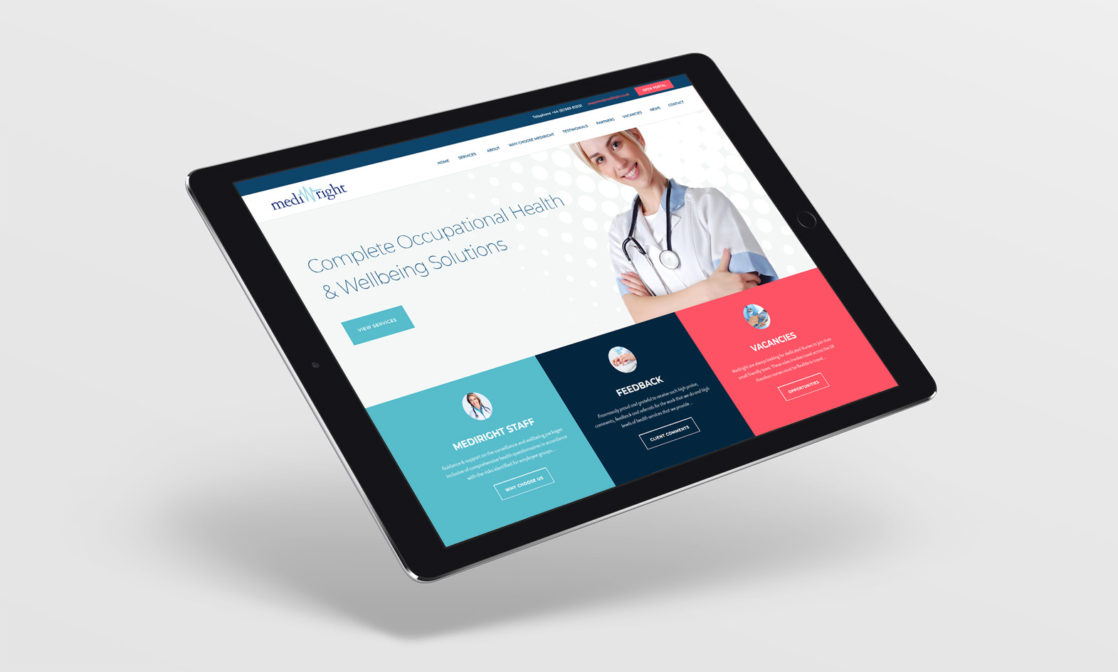

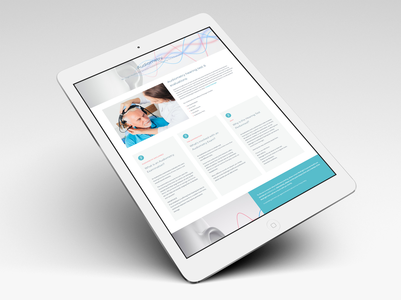
A clean, bold, and modern incarnation, with structured pages embodies a slick user experience heightened by an intuitive responsive framework. Our new solution for Mediright Corporate Healthcare stands head and shoulders above rival sites, exceeds client dreams, and brings the brand right up to date.
Mediright literature & marketing material
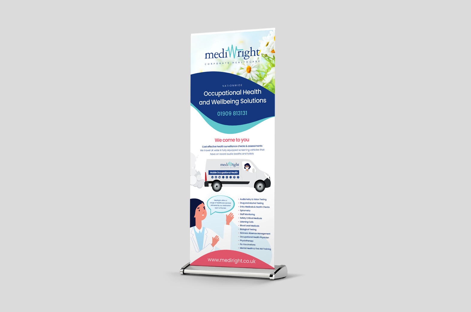
Graphic design and print media work in conjunction with their online style. So impressed with our online results, Mediright appointed us to look into revamp their corporate brochures and printed material. As a result, this would then bring everything in line with a single style structure. Our work to date has taken the form of corporate brochures, folders, leaflets, flyers, roller banners, as well as a range of office stationery.
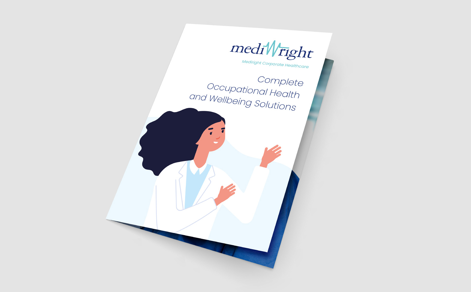

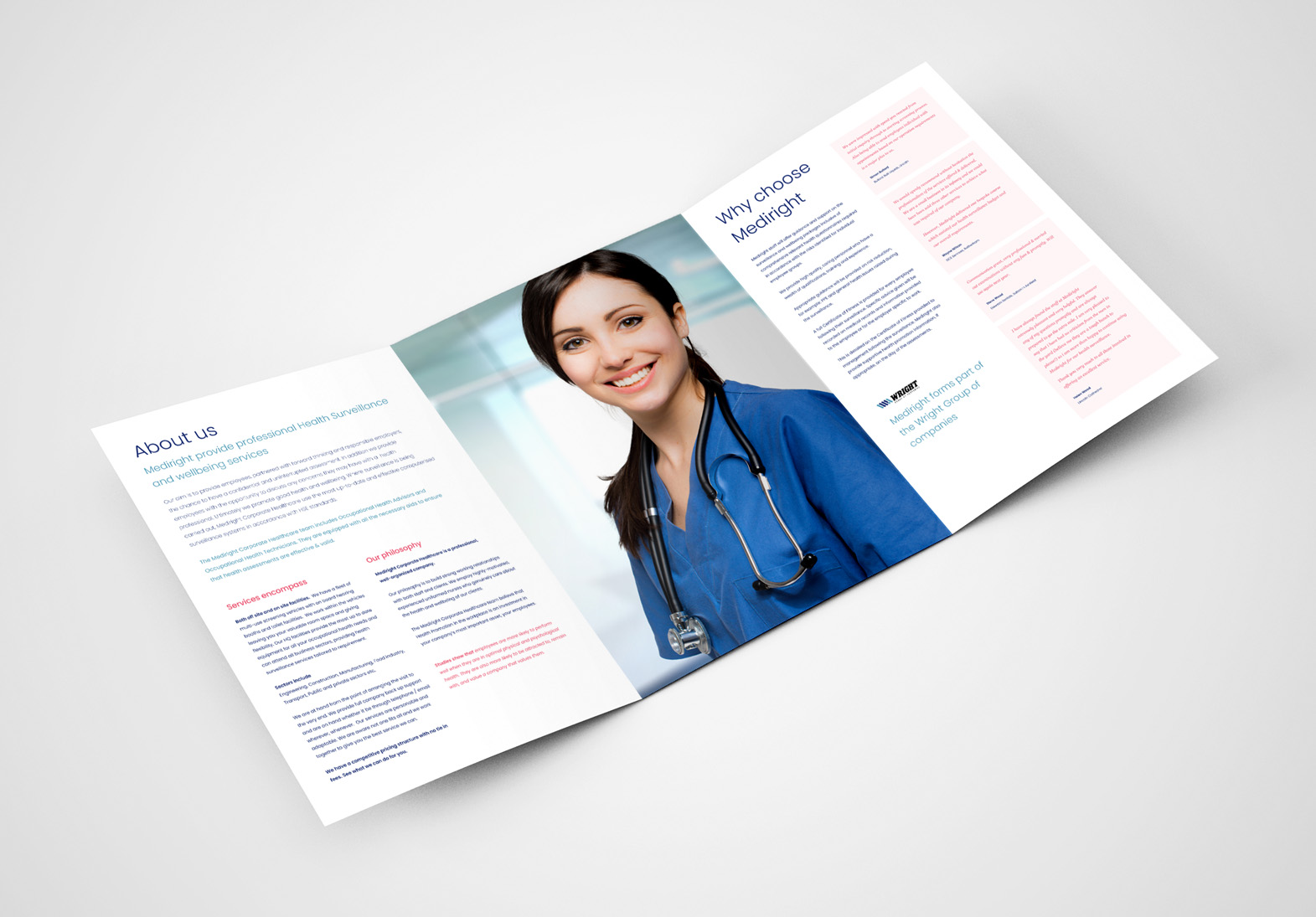
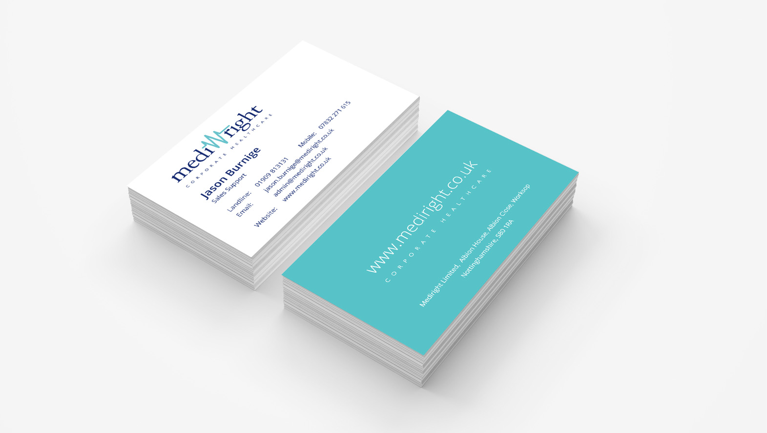
Followed on by branded stationery for a seamless visual identity.
Bringing a client concept to life.
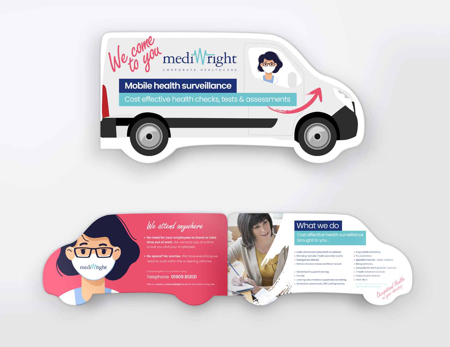
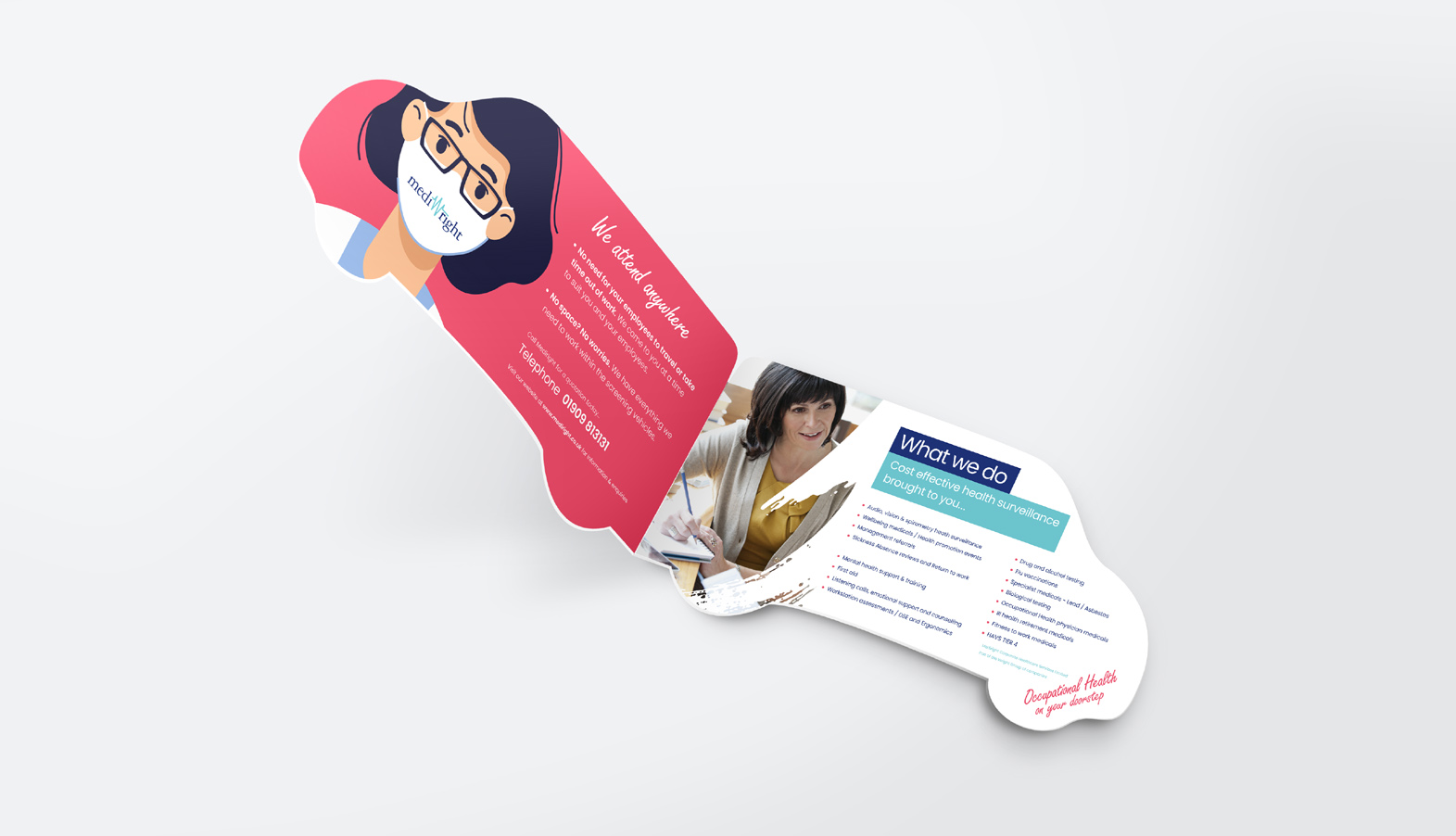
During our meetings, Mediright raised a custom leaflet idea to hand out to visitors. The result – a neat little promotional tool for direct marketing. Our client felt that a standard A5 flyer would appeal less than an fun and creative approach. Consequently, inspiration came from their fleet of healthcare vehicles…
“Wouldn’t it be great if our vans were our flyers?” We therefore came up with this unique folded flyer. This soon began to receive high levels of positive feedback, boosting enquiries by an incredible 33%.
